
A Heat map is used to visualize the density of data using colors where highest data value is displayed through dark heated color, and same color turns in light color for lowest values.
In Power BI, you can convert a Matrix table into table Heat map, you just need to apply some conditional formatting in matrix table.
Lets see here we have a sample data set of Sales by Month and year.

Lets take this data into matrix visual and create a simple sales report to show Sales done by Month and Year.


Now we will format this matrix table and convert it into table Heat map.
Lets go to the formatting Tab and set Style type to None. It will remove row formatting such as alternate row colors and borders.


Now in Conditional formatting, enable Background color and click on Advance controls.

Once you click on Advance Controls, a Background color dialog box opens.
Here you can set a color based on minimum and maximum value.
Now its totally depends on you, how do you set the color formatting. You can go either with default color formatting in our case such as light blue color for lowest data values and dark blue color for highest data values to receive the viewer attention or you can set different color such as red color for lowest data value and green color for highest value.

Now take a look on matrix, and you will see the background color of highest value is shown in dark blue color and lowest value is shown in light blue color box, so the color format will vary light blue to dark dark blue based for lowest value to maximum value.

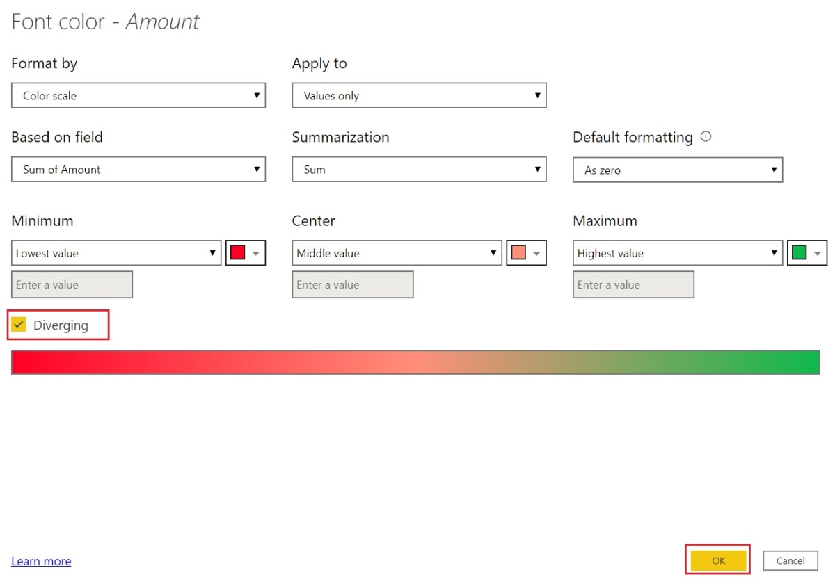
Now in case, if you want to distribute data into three colors such as color for minimum, center and maximum values then you can enable Diverging.
Enabling Diverging allows you to set color for minimum, center, and maximum values as shown below.

Lets change the colors for minimum values to Red, for center values to light Red and maximum values to Green.

After making these changes click on OK button.

You can see, now matrix is converted into Heat map, where values having dark green color background indicates highest values, and less green color indicates less highest values while dark Red color indicates lowest values and light red color indicates some ranges of values between lowest and highest values.
So, it becomes easy for users to focus on either dark red color to see the lowest recorded sales for any year, month or focus on dark green color to see the highest recorded sales for any year, month.
If you do not want to show sales amount on visual, you can do it by setting up a conditional formatting for font’s color as shown below.
In Fields Tab, right click on Amount then navigate to Conditional formatting and select Font Color


Now you will see a Font color dialog box opens, you just need to set same color as you did for background color.
Next click on OK button.
Now you can see, matrix looks more like a Heat Map and more interactive than previous.

Also Read..
Show/Hide Measures in Line chart visuals using slicer in Power BI
Creating a relationship between tables when both table have duplicate values
Visual Zoom Sliders Feature in Power BI
![]()