
A Radial Gauge chart has a circular arc and shows a single value that measures progress toward a goal or a Key Performance Indicator (KPI).
The line or needle represents the goal or target value. The shading represents the progress toward that goal and the value inside the arc represents the progress value. Power BI spreads all possible values evenly along the arc from the minimum that is a left-most value in chart to the maximum that is a right-most value in chart.
Consideration of using radial gauge chart, recommended by microsoft as follows:
- When to show progress toward a goal.
- When to represent a percentile measure such as KPI.
- Show the health of a single measure.
- Display information you can quickly scan and understand.
Lets see how to create a Radial Gauge chart in Power BI.
Here we will be using a default sample dataset financials that you can find within Microsoft Power BI desktop (default sample data is available in Power BI desktop October 2020 version or later version)
Open you Power BI desktop, and click on try a sample dataset as shown below.

After clicking on Try a sample dataset, a dialog box appears. Just click on Load sample data.

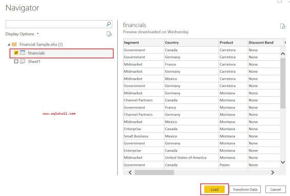
After that, a Navigator dialog box appears. Select a financials dataset from Financial Sample.xlsx file and click on Load button as shown below.
After that, you will see a financial dataset is loaded into Power BI desktop, that can be seen in Fields pane or Data view page.

Now we have a sample dataset named financials, Lets create a radial gauge chart to track a Gross Sales.
Go to Visualizations pane and drag a Gauge visual into report page as shown below.

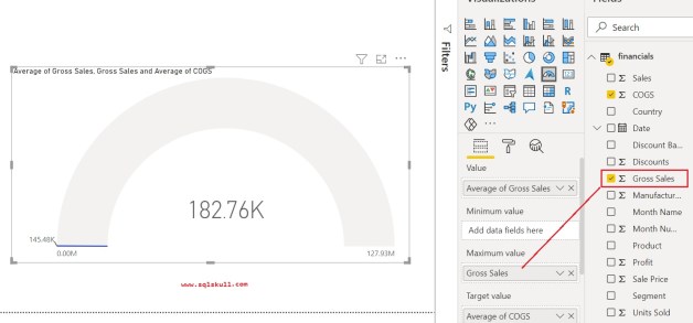
Now select the Gross Sales from Fields pane and drag it into Value well of Gauge chart.

Lets change the aggregation of Gross Sales from Sum to Average, right click on Gross sales in and select Average from context menu.

Now Gurage displays a Average of Gross Sales.

By default, Power BI Sets a start value (Minimum) and end value (Maximum) value based on Value field.
You can see it creates a gauge chart where it assumes the current value (in this case, Average of Gross Sales in Value field) is at the halfway point on the gauge. Since the Average of Gross Sales value is 182.76K, so the start value (Minimum) is set to 0 K and the end value (Maximum) is set to double the current value that is 365.52K.
Specifying a Target Value
Now we will set a Target Value, Lets drag a COGS fields to Target well, also change the aggregation to Average, just right click on COGS and select Average from context menu.

You can see, Gauge displays that that we have exceeded our target.
Also note that you can set Target value manually as well.
Specifying a Maximum Values
As we have already seen that Power BI by default set a minimum and maximum values based on Value field, that is minimum value is 0 while maximum value is double is set to double the current value.
In case, if you want to set your own maximum value instead of using double the current value as the maximum possible value, you want to set it to the highest Gross Sales number in your dataset.
Lets drag the Gross Sales from fields pane to Maximum Value well as shown below.
After that change the aggregation to Maximum.

Now you can see, gauge displays a new end value that is 1.21 M in gross sales.

Specify maximum, minimum and target values manually
You can set maximum and minimum values manually, Before this you need to remove Maximum of Gross Sales from the Maximum value well and Average of COGS from Target value well.

Now go to Format pane, then expand Gauge Axis and enter the minimum, maximum, and target values.

Now gauge chart looks like as shown below.

Also Read..
Implementing a table Heat Map in Power BI
Small Multiples Chart (Preview) in Power BI
![]()